
Microsoft To Do review: A to-do list app that makes you do too much
Microsoft doesn’t have the vast library of successful smartphone apps that mobile OS makers like Google and Apple can boast. Nonetheless, the company’s constant presence in the productivity and business markets has given it a solid platform from which to launch successful mobile offerings within the Office ecosystem. But, these remain primarily targeted at business users.
In a bid to move further into the consumer demographic, Microsoft debuted its own to-do list app, the very-on-the-nose Microsoft To Do. This app takes the traditional task management recipe and runs it through the filter of Microsoft’s current app design philosophies. The result is a robust, if occasionally disjointed, option for organizing your personal tasks and the goals of your entire family or team.
Let’s take a deep dive into how Microsoft To Do performs as a task management app for those trying to organize their personal lives, increase their at-work efficiency, or do both at once.
![]()
Like
- Comprehensive task management notification scheduling
- Simple, useful Apple Watch integration
- Completely free
Don’t Like
- Disjointed design philosophy and interface choices
- First-party integrations are very limited in use
- Smart Lists don’t offer much value or functionality
Test Setup
My review will focus on the iOS version of Microsoft To Do. It is also available as an Android app, and on desktop via the web. The iOS and Android versions of the app are mostly identical, while the web-based version relies more heavily on a two-pane design with a text-heavy approach to handling the solution’s task management interface.
All three versions are similar enough that familiarizing yourself with one should reduce or eliminate any adjustment period required to use any other version. Still, the positioning of the desktop version within the Microsoft 365 ecosystem may incorrectly lead users to believe that it’s part of a paid subscription. It isn’t. Of course, a quick web search will allay this confusion, but Microsoft could definitely do a better job of promoting its availability, especially within the iOS or Android apps.
More: What is Microsoft 365 (formerly Office 365)? Everything you need to know
As with most modern, multi-platform apps, any changes made within one version of Microsoft To Do will be synced across to all other versions.
Michael Gariffo
Functionality
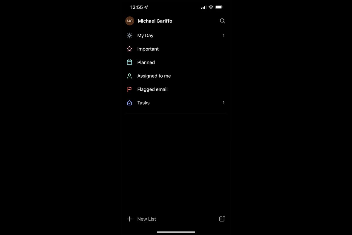
Microsoft To Do organizes your tasks into three tiers: groups, lists, and tasks. Groups hold multiple lists that share some similar purpose, while lists serve as collections of multiple tasks gathered around any one theme. Only user-created lists can be added to groups, the pre-made “Smart Lists” that ship with the app cannot.
Any list you create yourself, as well as the default Smart Lists included within Microsoft To Do, permanently live on its main screen. These default lists are:
-
My Day – A list of any tasks with reminders or due dates scheduled for the current day.
-
Important – A collection of any tasks you’ve “starred,” which automatically adds them to this list.
-
Planned – Includes all tasks with due dates or reminders set to them, regardless of when they take place.
-
Assigned to me – A list of all tasks assigned by collaborators appears here.
-
Flagged email – All messages flagged for To Do via Outlook will show up here.
-
Tasks – a catch-all list that collects any tasks that aren’t already assigned to one of your custom-created lists.
While some may appreciate the variety of auto-sorting “Smart Lists” To Do provides, I found it to be overkill. The ability to create custom lists for these purposes could fulfill the same needs, especially since only one Smart List actually handled tasks the way I’d have preferred.
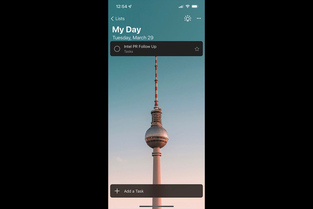
Michael Gariffo
That list, My Day, was a handy way for me to see what tasks I needed to complete within the next 24 hours. But, I have to note that the usage of a background image in My Day just felt odd. The images within it have that same serene aesthetic that most Windows 10 lock screen pics share. But, the fact that it is literally the only image used throughout the entire app makes it seem…out of place. Hardly a major issue, but symptomatic of a more widespread lack of cohesive design that will become apparent as this review continues.
As you’ve probably guessed, I largely ignored the pre-created lists (aside from My Day) and created my own lists and tasks. In this way, To Do is very similar to competing offerings like Google’s Tasks app, making it relatively simple and easy to title a task, add a due date, include notes, and save it. To Do is also somewhat unique in allowing you to attach a file to the task, for when you need an image or document to help you get something done.
More: Best task management software
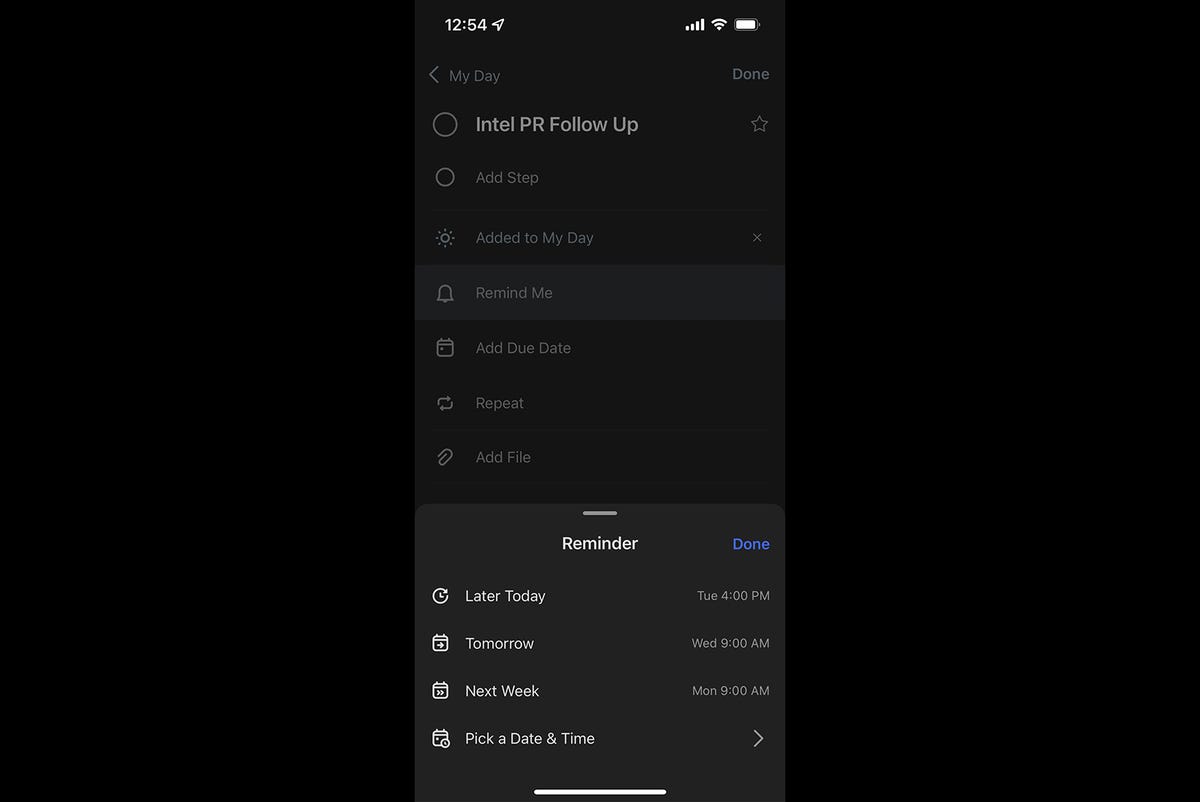
The only sticking point in this process is setting reminders and due dates. While I do appreciate that these can be set separately, allowing for pre-deadline reminders, I wish Microsoft would have just gone with a more standard method of immediately allowing you to input a date and time. Instead, tapping “Remind Me” presents the following options: Later Today, Tomorrow, Next Week, or Pick a Date & Time. Meanwhile, “Add Due Date” brings up a similar list, with the exception of the last choice, which is Pick a Date, no specific time setting offered.
Some of you out there might appreciate the availability of these one-tap, somewhat imprecise settings when choosing your reminder times and due dates. However, it just added an extra step for me when sticking to the traditional method of tapping a calendar date and flipping through numbers to choose the precise time and day I’d prefer. This is another issue that’s far from a deal breaker, but one of several little hiccups that make using the app less pleasant than it otherwise would be.
I found the reminder and due date notifications in To Do to be reliable, useful, and easily managed. The initial setup might have been a bit rockier than I’d have liked, but the extra effort did eventually provide a solid scheduling tool that definitively improved my task management.
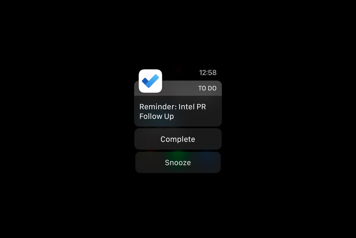
A typical Apple Watch notification
Michael Gariffo
Wearables and widgets
Microsoft To Do features basic wearable functionality on iOS. Its Apple Watch notifications include the name of the task, a Complete button to mark the task as finished, a Snooze button to postpone your reminder by 10 minutes, and a Dismiss button to get rid of the notification entirely. It’s a handy way to mark off completed tasks, but it doesn’t offer much in the way of detailed task management, which still requires you to take out your phone.
Microsoft does not offer a native Apple Watch app, nor does it offer a Wear OS companion app for its Android version.
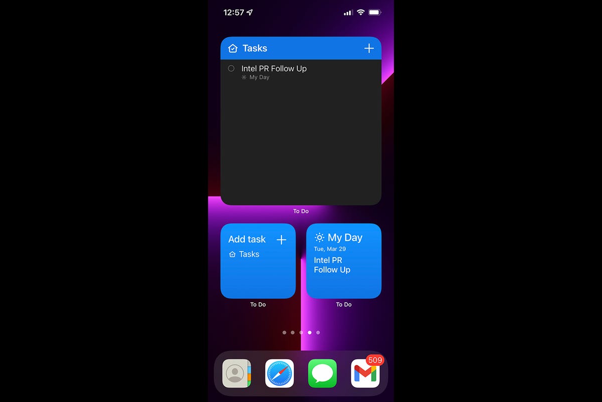
Microsoft To Do’s Widgets: Your Tasks – Large (top), Add Task (bottom left), and My Day (bottom right)
Michael Gariffo
For iOS users that want access to their to-do lists at a glance, Microsoft provide a total of four Widgets:
-
My Day – a 2×2 Widget that lists the tasks included on your My Day list within the app. Tapping it opens the app’s My Day section, as you’d expect.
-
Add Task – a 2×2 Widget that lists current tasks from the Tasks list, and provides a “+” button for adding new tasks.
-
Your Tasks – a 4×2 Widget with a list of up to 3 ongoing tasks, all of which can be marked complete without having to open the app. It also includes a “+” button for adding tasks.
-
Your Tasks – A larger version that provides the same functionality but takes up essentially an entire iOS home screen page, allowing for the inclusion of a far larger list of tasks.
All of the Widgets worked well, and provided exactly the kind of momentary, at-a-glance interactions you’d expect to be able to complete without having to open the app.
The pair of Your Tasks widgets were made particularly useful due to having the ability to choose which list they draw their included tasks from. I found it to be a simple way to drop a shopping list onto my iPhone’s home screen for short-term reference. It was one of the app features I found myself using the most during my testing.
Service integrations
Microsoft integrated its Outlook email and Planner solution to help To Do gain access to communications and collaborations tools. Unfortunately, I found both to be very limited. The first limitation came from the fact that no one I knew, at work or home, was actively using Planner. Simply put, I had no one to collaborate with. This is, of course, more a statement about the popularity of an entirely separate product. But, it’s important to note because the likelihood of your colleagues already using a given platform determines the immediate usefulness of that platform to you. In this case, that usefulness was nil.
More: Microsoft marches toward its ‘One Outlook’ rollout
Outlook’s interactivity with To Do was slightly more useful, since it didn’t rely on the widespread adoption of another Microsoft solution. However, the functionality was quite basic. Tapping “Create a Task” within an email in the Outlook app on iOS created a task with its title set to the originating email’s subject line. That’s it. You can then find the created task in To Do, where you’ll see that it also includes a unique field populated with a snippet from the email’s body, and a button to be taken directly to the message within Outlook.
I actually found the ability to create tasks around emails very useful, in concept. Receiving an email is often the catalyst for having to remember to do something later, after all. However, I wish I could immediately set parameters like reminders and due dates within the Outlook interface. As it stands you have to go back into To Do itself, find the created task in the Tasks list, and then tap it. Only then can you edit its details. This is yet another feature maddeningly close to being useful, but just clumsy enough to make me not want to bother with it on a regular basis.
More: Microsoft to increase integration between Teams, Outlook, and Dynamics 365
The only third-party service integration of note within To Do is its ability to tie into Siri Shortcuts, offering an array of voice-based options for creating, scheduling, and managing tasks. This also happens to be the one integration I found genuinely handy in its current form, allowing me to add tasks while my hands were full, or quickly set timed reminders within the app’s platform.
Michael Gariffo
Performance
Microsoft’s app did exactly what I’d want a to-do app to do. It just always seemed to be intent on making me take annoying extra step or two. It also offered potentially useful integrations that should have made adding new tasks via email and collaborating via Planner easier. But, both of these were stifled by overly basic interactions between apps and a lack of widespread adoption, respectively.
More: Best project management software
Along similar lines, the default screen includes too many Smart Lists, almost none of which I found useful in my time with the app. I should note you can hide almost all of these by visiting the app’s settings, with the sole exception being My Day, which you’re stuck with.
Again and again during my testing I found myself appreciating the usefulness of To Do’s reminders, and the organizational benefits its scheduling and management feature could provide. But, I also found myself just as frequently trying to find ways to avoid having to create a new task due to how unwieldy I found the app’s interfaces and design choices. Actively making a user wish they didn’t have to go through the trouble of using your product is, obviously, not a good look for an app that’s specifically designed to be an integral part of your daily routine.
Wrap Up
I believe Microsoft may have been trying to please too many disparate demographics with To Do. The friendly background of My Day reflects an app that was supposed to appeal to the average user just trying to plan their day’s errands and goals. Meanwhile, the half-baked Outlook and Planner integrations suggest that its trying to be a corporate tool, a watered-down version of Microsoft Teams, rather than a general use task manager app.
Microsoft should have spent more time on tuning the basic to-do list functionality for ease-of-use, and less time on trying to make the app into something it was never really designed for. Even if the result was slightly more limited in some ways, it would have better captured my loyalty through the beneficial simplicity those minor limitations provided. As it stands, I’ll be looking elsewhere to keep my daily to-do list a little more manageable.
Possible Alternatives
- Google Tasks – Google’s simpler, if slightly more limited, take on a task management app that focuses entirely on helping you create user-controlled lists and apps. See our review here.
- Todoist – An equally simple option with color-coded lists. It also offers a native Apple Watch app and a more platform-agnostic approach to third-party integrations. Includes a paid Pro Plan option with enhanced features.
- Any.do – A calendar-focused app offering colorful interfaces with a “focus mode” to help you avoid distractions. Includes a monthly subscription version with enhanced organization and collaboration features for multiple users.
- Remember the Milk: To-Do List – The app that arguably founded the genre. Its latest version integrates email, text, and messaging notifications; cross-device sync, third-party integrations, and more. A paid, annual subscription with enhanced features and storage capacity is available.
- TickTick – Combines Google Tasks’ simplicity with Any.do’s focus mode, while adding a unique habit tracker to help make you more productive. Includes a Premium option that removes task limits.


